The two dimensional plot section provides extensive options to create customized plots and visualize your data.
Read on for further explanation:
Transfer data from tables into the plot dialog
Mark any data cells which you want to transfer into the plot dialog. The data from the tables is copied into the plot function. The plot dialog presents a plot suggestion: The first column is interpreted as x data, any other columns are plotted in respect to the first one. You might delete, add and modify any of them on the plot filter page or create new ones.
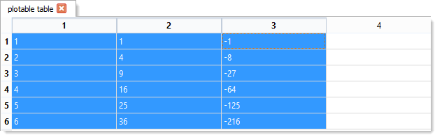
The following example will create two plots from three marked columns which can be modified or deleted later in the plot dialog window.
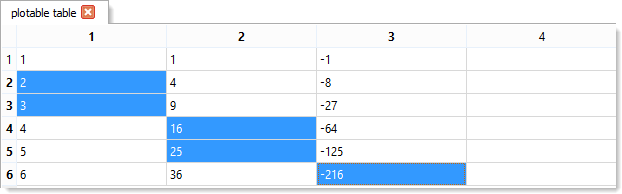
This second example will not create any plot because no data tuple with the same row index is marked.
Note: Once the data from the table is copied into the plot dialog, any changes of the table data will not modify your plots.

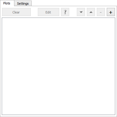
The plot filter page provides an overview of the currently created plots. First its name is shown followed by the column number of the y and x data.
When you create a new plot from the plot filter dialog or modify an existing one, the plot options dialog is shown. It enables you to define the
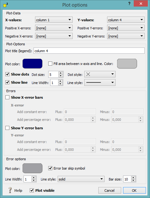
Define the location of your x and y data and optional the error data.
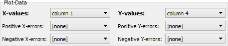
Label your plot and choose its appearing color. Select if the area between the plot and the y axis should be filled and colorize it.
Specify if the dots or the line is displayed and define their size and style.
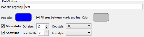
Activate the optional error bars and specify a constant or percental error or even both. The error bars might be asymmetric as you might choose different error bars for plus and minus. Select the error bar color, line width, line style and bar size.
You might hide or display plots by deselecting or selecting the visibility flag at the left bottom of the dialog.

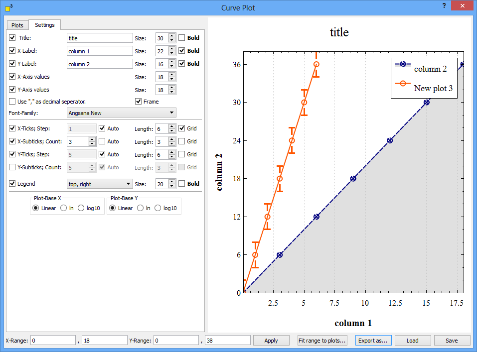
Graph settings page - title, labels, legend and bases
The graph settings page structures the properties for
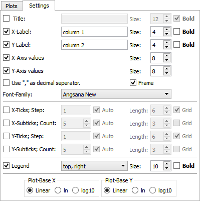
This section sets the properties for titles and labels. Activate the title or labels and name them. Define their size, style and their font family. When you use "," as a decimal separator, activate this option.
The ticks and sub-ticks properties are arranged in the middle of the settings page. Select which kind of ticks or sub-ticks you prefer and specify their number manually or automatically. A grid might be added to the plot window. Define which ticks or sub-ticks should be emphasized and activate the appropriate check-boxes.
For each plot a legend can be created automatically if requested. Place the legend at one out of eight default spots and specify its size and style.
Three kind of plot bases for the x and y axes are available: linear, natural logarithm and decadic logarithm. Select the appropriate option.
Range, export, load and save options
You find the range, export, load and save options at the bottom part of the plot dialog.

Set the minimum and maximum values of each axis and press the "Apply" button. You might use the automatic option "Fit range to plots..." or turn the mouse wheel as well.
The plot dialog offers the possibility to export the current plot as pdf, png, bmp and jpeg files. Click on the "Export as..." button and select the applicable file type.
With the help of the load and save functions, you are able to store your plots in the dotCube format on hard disk.